How to Design a High-Converting Landing Page for Your Business
Learn how to design a landing page that converts visitors into customers. Proven strategies for headlines, CTAs, layout, and optimization.
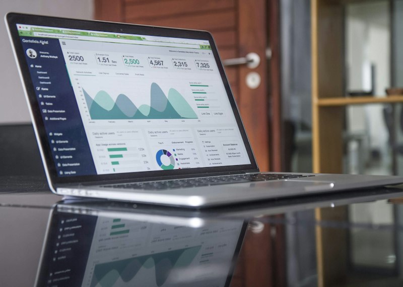
A landing page is a standalone web page created specifically for a marketing campaign. Unlike your homepage or about page, a landing page has one single goal: to convert visitors into leads or customers. Whether you are promoting a service, collecting email signups, or selling a product, your landing page is where the conversion happens.
The difference between a good landing page and a great one can be measured in conversion rate. A well-designed landing page can convert 5 to 10 percent of visitors or more, while a poorly designed one struggles to reach 1 percent. The good news is that landing page design follows proven principles that anyone can apply.
Table of Contents
- What Makes a Landing Page Different
- Writing a Headline That Grabs Attention
- Designing for Clarity and Focus
- Crafting a Compelling Call-to-Action
- Building Trust With Social Proof
- Removing Distractions and Friction
- Testing and Optimizing Your Landing Page
- Conclusion
- Frequently Asked Questions
What Makes a Landing Page Different
A landing page is different from other pages on your website because it has a single objective. Your homepage needs to serve many purposes — introducing your brand, showcasing your services, building trust, and guiding visitors to different sections. A landing page strips away everything except what is necessary to achieve one specific goal.
This singular focus is what makes landing pages so effective. With no navigation menu, no sidebar, and no links to other pages, visitors have only two choices: take the desired action or leave. Removing alternatives dramatically increases the likelihood that visitors will choose the action you want them to take.

Writing a Headline That Grabs Attention
Your headline is the first thing visitors see when they land on your page. It has one job: to make them want to keep reading. If your headline does not capture attention within a few seconds, the rest of your carefully crafted landing page will go unread.
An effective headline is clear, specific, and benefit-driven. Instead of 'Web Hosting Services,' use 'Fast, Secure Web Hosting for Small Businesses — Get Online in Minutes.' The second headline tells visitors exactly what they will get and what makes it different. It creates interest and sets expectations.
Support your headline with a subheadline that adds context or addresses a specific pain point. Together, the headline and subheadline should communicate your unique value proposition clearly enough that visitors understand what you offer and why it matters within seconds.
Launch a High-Converting Landing Page Today
HostBetter makes it easy to host your landing pages with fast, reliable infrastructure. Free SSL, custom domains, and the performance you need to convert visitors. Apply now.
Apply NowDesigning for Clarity and Focus
The visual design of your landing page should direct attention toward your conversion goal. Every element should serve a purpose — if it does not help persuade visitors to convert, remove it.
- Use a clean, uncluttered layout with plenty of white space around key elements
- Place your most important content above the fold so visitors see it without scrolling
- Use contrasting colors for your CTA button to make it stand out visually
- Keep your page short — include only the information needed to make a decision
- Use directional cues like arrows or images of people looking toward your CTA to guide the eye
- Ensure your page loads quickly — every second of delay reduces conversions
Remember that mobile visitors will likely see your landing page first. Design for mobile from the start, ensuring your layout, fonts, and buttons work perfectly on small screens. A landing page that looks great on desktop but breaks on mobile will lose most of its potential conversions.
Crafting a Compelling Call-to-Action
Your call-to-action is the most important element on your landing page. It is the moment of truth where a visitor decides whether to take the next step. The wording, design, and placement of your CTA significantly impact your conversion rate.
Use action-oriented language that describes exactly what will happen. 'Get Your Free Quote' is more effective than 'Submit.' 'Start Your 14-Day Free Trial' is better than 'Learn More.' The more specific your CTA, the clearer the value proposition to the visitor.
Place your primary CTA prominently above the fold and repeat it naturally further down the page for visitors who need more information before deciding. Each CTA should look identical to maintain consistency.
Building Trust With Social Proof
Visitors are naturally skeptical, especially when they encounter a business for the first time. Social proof helps overcome this skepticism by showing that other people have trusted you and been satisfied with the result.
- Include customer testimonials with real names, photos, and specific results
- Display logos of companies or clients you have worked with
- Show trust badges like SSL certificates, security seals, and industry affiliations
- Feature relevant statistics like number of customers served or years in business
- Include media mentions or press coverage if applicable
Place social proof elements near your CTA buttons to address last-minute objections. A testimonial next to your CTA can be the nudge a hesitant visitor needs to convert.
Removing Distractions and Friction
Every element on your landing page either helps or hurts your conversion rate. Distractions like navigation menus, sidebars, footer links, and multiple offers confuse visitors and reduce conversions. Friction includes anything that makes taking action difficult, like long forms, unclear instructions, or slow page load times.
Remove your main navigation menu from landing pages — visitors who want to learn more about you can do so after converting. Keep forms as short as possible, asking only for essential information. Ensure your page loads in under two seconds on both desktop and mobile.

Testing and Optimizing Your Landing Page
The best landing pages are not designed in a single attempt. They are refined through continuous testing and optimization. What works for one audience may not work for another, and small changes can have significant impacts on conversion rates.
Run A/B tests to compare different versions of your landing page elements. Test headline variations, CTA button colors, form lengths, image choices, and page layouts. Let the data tell you what works best rather than relying on assumptions.
Conclusion
A high-converting landing page is one of the most valuable assets in your marketing toolkit. By focusing on a single goal, writing compelling headlines, designing for clarity, crafting strong CTAs, building trust with social proof, and removing distractions, you create a page that turns visitors into customers.
Start with the fundamentals and improve through testing. Even small improvements in conversion rate can have a significant impact on your business results over time.
Frequently Asked Questions
What is the difference between a landing page and a homepage?
A homepage serves as a general introduction to your business with navigation to multiple pages. A landing page has a single specific goal, no navigation menu, and is designed to maximize conversions for a particular offer or campaign.
How long should a landing page be?
Landing page length depends on your offer. Simple offers with low commitment (like email signups) work well with short pages. Complex or expensive offers may need longer pages with more details, benefits, and social proof to build enough trust for conversion.
What is a good landing page conversion rate?
Average landing page conversion rates vary by industry, but a rate of 5 to 10 percent is considered good. Top-performing landing pages can achieve 20 percent or higher. Focus on improving your own rate over time rather than comparing to benchmarks.
Should I use a separate domain for landing pages?
No, keep landing pages on your main domain. Using a subdomain or separate domain can confuse visitors and dilute your SEO authority. A simple subfolder like yourdomain.com/landing-page-name works best.
How many CTAs should a landing page have?
One primary CTA is ideal, repeated two to three times on longer pages. Multiple different CTAs confuse visitors and reduce conversions. Every element on your page should support the single primary action you want visitors to take.
People Also Ask
What are the key elements of a high-converting landing page?
Key elements include a clear benefit-driven headline, focused layout with no navigation, compelling call-to-action button, social proof like testimonials, trust signals, and a form that asks only for essential information. Remove all distractions that do not support conversion.
How do I write a good landing page headline?
A good headline is clear, specific, and benefit-driven. It communicates your unique value proposition within seconds. Support it with a subheadline that adds context. Test different headline variations to see what resonates with your audience.
How do I optimize a landing page for mobile?
Design for mobile first. Use large, tappable buttons, readable font sizes, short form fields, and fast-loading images. Test your page on real mobile devices. Avoid pop-ups and interstitials that are hard to close on small screens.
Featured Snippet: Landing Page Design Guide
To design a high-converting landing page, use a clear benefit-driven headline, remove navigation menus and distractions, include a single focused call-to-action, add social proof like testimonials near your CTA, keep forms short, design for mobile first, and continuously test different elements to improve conversion rates.
Host Your Landing Pages With HostBetter
HostBetter provides the reliable infrastructure your landing pages need. Fast load times, free SSL, and easy deployment. Apply now to get your high-converting pages online.
Apply Now