Mobile-First Web Design: Why It Matters and How to Implement It
Learn why mobile-first web design is essential for modern business websites, how it improves user experience and SEO, and practical steps to implement it.
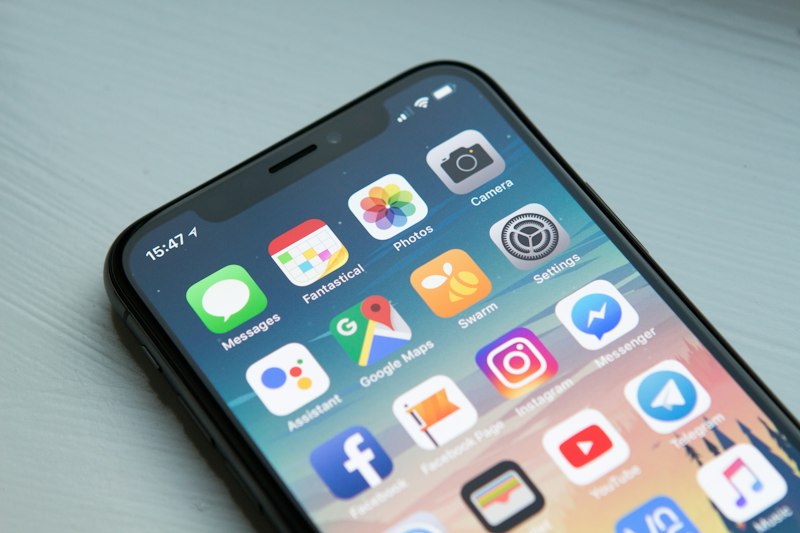
The way people access the internet has fundamentally changed. Mobile devices now account for the majority of global web traffic, and that share continues to grow. Yet many business websites are still designed with desktop users as the primary audience, with mobile treated as an afterthought. This approach is costly — both in lost traffic and lost revenue.
Mobile-first web design flips this approach. Instead of designing for a large desktop screen and then shrinking it down for mobile, you start with the smallest screen and progressively enhance the design for larger devices. This ensures that every mobile visitor has an excellent experience, which is critical since mobile users are often less patient and more likely to leave a poorly designed site.
Table of Contents
- What Is Mobile-First Web Design?
- Why Mobile-First Design Matters for Your Business
- Google's Mobile-First Indexing Explained
- Key Principles of Mobile-First Design
- Practical Steps to Implement Mobile-First Design
- Common Mobile Design Mistakes to Avoid
- Mobile-First vs Responsive Design: What Is the Difference?
- Conclusion
- Frequently Asked Questions
What Is Mobile-First Web Design?
Mobile-first web design is a design philosophy where you create the mobile version of your website first, then expand and enhance it for larger screens like tablets and desktops. This approach forces you to prioritize what is truly important. On a small screen, you cannot afford clutter. You must make deliberate choices about what content and features matter most to your users.
The traditional approach — desktop-first design — starts with a large canvas where you can add everything you want. Then you try to cram that content into a mobile layout, which often results in a cluttered, frustrating mobile experience. Mobile-first design avoids this problem by starting with constraints and adding complexity only when there is room for it.
This does not mean building a stripped-down mobile site. It means building a focused, streamlined experience for mobile users and then taking advantage of larger screens to add more content, visuals, and functionality where appropriate.

Why Mobile-First Design Matters for Your Business
- Over 60 percent of web traffic now comes from mobile devices
- Mobile users have higher expectations for speed and usability
- Google uses mobile-first indexing, meaning it primarily evaluates your site based on its mobile version
- Poor mobile experience drives visitors to competitors
- Mobile-first design improves page load speed, which boosts SEO and conversions
- Mobile-friendly websites rank higher in local search results
For small businesses, the mobile experience is often the deciding factor between gaining or losing a customer. A potential customer searching for your services on their phone will form an opinion about your business in seconds. If your site is hard to navigate, slow to load, or requires constant pinching and zooming, they will leave and find a competitor whose site works better on mobile.
Google's Mobile-First Indexing Explained
Since 2021, Google has used mobile-first indexing for all new websites. This means Google primarily uses the mobile version of your website for indexing and ranking. If your mobile site has less content, slower load times, or a worse user experience than your desktop site, your search rankings will suffer.
Mobile-first indexing makes mobile-friendly design a direct SEO requirement. You cannot compensate for a bad mobile experience with a great desktop site. Google evaluates what mobile users see and experience, so your mobile site must be at least as good as your desktop version in terms of content, structure, and performance.
This is why mobile-first design is not optional for businesses that want to rank well in search results. A mobile-first approach ensures that what Google sees on mobile is intentional, complete, and optimized, not a squeezed-down afterthought.
Build a Mobile-First Website for Your Business
HostBetter provides fast, reliable hosting that ensures your mobile-first website loads quickly on all devices. Free SSL, custom domains, and easy deployment. Start building today.
Apply NowKey Principles of Mobile-First Design
Content Prioritization
On a small screen, every element must earn its place. Start by identifying the core purpose of each page and the single most important action you want visitors to take. Everything else is secondary. This forces you to focus on what truly matters for your users and your business.
Touch-Friendly Interfaces
Mobile users interact with their fingers, not a mouse cursor. Buttons and links need to be large enough to tap accurately — at least 44 by 44 pixels according to Apple's guidelines. Leave enough space between tappable elements to prevent accidental taps. Avoid hover-dependent interactions since hover does not exist on touchscreens.
Performance Optimization
Mobile users are often on slower connections, so performance is critical. Optimize images for mobile screens, minimize the use of heavy scripts, leverage browser caching, and use a content delivery network (CDN) to serve assets quickly regardless of the user's location. Fast-loading mobile pages improve user experience and SEO rankings.
Simplified Navigation
Navigation on mobile must be simple and intuitive. Use a hamburger menu or bottom navigation bar to save screen space. Limit the number of menu items to the most essential pages. Include a search function so users can find what they need quickly without browsing through multiple levels of navigation.
Practical Steps to Implement Mobile-First Design
- Start with a mobile wireframe — sketch out your mobile layout before touching any code, focusing on content hierarchy and key actions
- Use a responsive grid system — CSS frameworks like Tailwind CSS make it easy to build responsive layouts that adapt to any screen size
- Optimize images for mobile — use responsive images with srcset attributes to serve appropriately sized images based on the device
- Test on real devices — emulators are useful but nothing replaces testing on actual smartphones and tablets
- Prioritize above-the-fold content — ensure the most important content and CTA are visible without scrolling on mobile
- Minimize pop-ups — intrusive interstitials on mobile harm user experience and can lead to Google penalties
- Use mobile-friendly fonts — avoid font sizes smaller than 16 pixels and ensure sufficient line height for readability
HostBetter supports mobile-first websites with fast hosting infrastructure, free SSL, and easy deployment. When you host with HostBetter, your site benefits from optimized servers that deliver content quickly to mobile users around the world.
Common Mobile Design Mistakes to Avoid
- Using desktop-only features like hover menus that do not work on touchscreens
- Blocking pinch-to-zoom, which makes content hard to read for users with visual impairments
- Auto-playing videos with sound, which is disruptive on mobile and consumes data
- Hiding important content behind tabs or accordions that users may not discover
- Using tiny fonts or links that are impossible to tap accurately on a small screen
- Ignoring landscape orientation — many users browse in landscape mode on larger phones
Avoiding these common mistakes will dramatically improve your mobile user experience. Test your site regularly on multiple devices to catch issues before they affect your visitors.

Mobile-First vs Responsive Design: What Is the Difference?
These terms are often used interchangeably, but they mean different things. Responsive design is a technical approach — it uses flexible grids, fluid images, and CSS media queries to make a website adapt to different screen sizes. Mobile-first is a design philosophy that determines how you approach the responsive design process.
You can have a responsive website that is not mobile-first. In fact, most responsive sites are designed desktop-first and then adapted for mobile. A mobile-first responsive site is one where the base styles are designed for mobile, and media queries add complexity for larger screens. This subtle difference has a significant impact on the final user experience.
Conclusion
Mobile-first web design is not a trend — it is a fundamental shift in how we build for the web. With mobile devices dominating web traffic and Google enforcing mobile-first indexing, businesses that prioritize mobile design gain a significant competitive advantage. Mobile-first sites load faster, rank higher, convert better, and provide a better experience for the majority of your visitors.
Start by auditing your current website on a mobile device. Identify pain points like small text, difficult navigation, and slow loading. Then adopt a mobile-first approach for any redesign or new site you build. The investment in mobile-first design pays for itself through improved SEO, higher conversion rates, and happier customers.
Frequently Asked Questions
What is the difference between mobile-first and responsive design?
Responsive design is a technical approach that makes a website adapt to different screen sizes. Mobile-first is a design philosophy where you design for mobile first and progressively enhance for larger screens. You can have a responsive site that is not mobile-first.
Is mobile-first design necessary for SEO?
Yes, because Google uses mobile-first indexing. This means Google primarily uses the mobile version of your website for ranking and indexing. If your mobile site is poor, your search rankings will suffer regardless of how good your desktop site is.
How do I start implementing mobile-first design?
Start by wireframing your mobile layout before writing any code. Focus on content hierarchy and the most important user actions. Use a responsive CSS framework like Tailwind CSS, optimize images for mobile, and test on real devices throughout the development process.
Does mobile-first design mean having a separate mobile site?
No. Mobile-first design uses responsive techniques to create a single website that works well on all devices. Separate mobile sites (like m.example.com) are an outdated approach that creates maintenance and SEO challenges.
How does mobile-first design affect website speed?
Mobile-first design typically improves website speed because it forces you to prioritize essential content and optimize performance from the start. Faster pages lead to better user experience, higher conversion rates, and improved search rankings.
People Also Ask
Why is mobile-first design important?
Mobile-first design is important because over 60 percent of web traffic comes from mobile devices, Google uses mobile-first indexing, and mobile users have high expectations for speed and usability. A mobile-first approach ensures your site performs well where it matters most.
What are the key principles of mobile-first design?
The key principles are content prioritization (focusing on what matters most), touch-friendly interfaces (large tap targets, no hover dependency), performance optimization (fast loading on mobile connections), and simplified navigation (clear menus, easy access to key pages).
How do I test if my website is mobile-friendly?
Use Google's Mobile-Friendly Test tool, test on real smartphones and tablets, check navigation and readability on various screen sizes, and verify that all interactive elements are easily tappable. Also run performance tests using Google PageSpeed Insights.
Featured Snippet: Mobile-First Web Design
Mobile-first web design is a design philosophy where you create the mobile version of your website first, then progressively enhance it for larger screens. It prioritizes content, optimizes performance, creates touch-friendly interfaces, and simplifies navigation. Mobile-first design is essential for SEO because Google uses mobile-first indexing, and it improves user experience for the majority of web traffic that comes from mobile devices.
Go Mobile-First With Your Business Website
HostBetter provides fast, reliable hosting that ensures your mobile-first website loads instantly on every device. Free SSL, custom domains, and seamless deployment. Apply now to get started.
Apply Now